Why Blue Continues to be History's Most Enduring Popular Color
/Blue is one of three primary colors along with red and yellow.
What The Color Blue Says About Your Personality
Take this color and personality quiz:
Are you a bit OCD? Do you like to keep your environment clean and organized?
Do you crave harmony in your surroundings and in your relationships?
Are you reliable?
Do you believe in being loyal - as a friend or intimate relationships?
Do you feel strongly about having stability in your life?
Are you sensitive, sometimes overly so?
Do you try to consider the feelings of others?
If you answered YES to four or more of these questions then you probably, also, like the color BLUE. That's what the color psychologists have to say about you.
"If you love blue, you’re not alone. 35% of Americans, of both genders, say blue is their favorite color."
Blue is the color of nature. From sky blue to turquoise oceans, blue covers much of our planet. From space, astronauts have described the Earth as "a great blue marble". But, why would you use blue in your home?
Whether you had more yes answers on the quiz or not, should you or would you use blue in your home? Brands love blue. But is it right for a home? Don't forget to weigh in on blue in the Comment Section below. Post some photos too!
Blue and Branding
Blue is good for business. It's widely used in marketing, branding, and fashion. Think Facebook, Twitter, Lowe’s, GE, Walmart, and IBM.
These are some of the biggies with biggie budgets. They, highly, analyze the market's reaction to color. Blue is a popular branding color but does that make it a good interior color?
Brands choose blue because, like you blue-lover, it signifies:
Dependability
Strength
Competence and wisdom
Trustworthiness and confidence
High quality
Stability
Truthfulness
The Wild and Crazy Meaning of Blue
If blue, in branding, has all the solid characteristics of John Wayne. Then, why is the meaning of the word so difficult to pin down?
"In my opinion, blue is THE most ambivalent color in the crayon box."
The contradiction of blue can be seen in the song, Blue Skies written by Irving Berlin in 1926. Funny historical note - Blue Skies was written for a Rodgers and Hart musical “Betsy”. The play got 24 encores! At one point, the singer, Belle Baker, forgot her lyrics and Irving Berlin, stood up and sang it from the front row.
Blue Skies has been sung by fabulous artists from a variety of genres - Diana Krall (2017), Willie Nelson (1978), Nat King Cole (1958), Josephine Baker (1927).
The funniest rendition is in Star Trek Nemesis - check that one out on YouTube for a chuckle.
But I digress. Blue is ambivalent because it's used both for “having the blues” meaning sorrow and in “blue skies” for happiness and good fortune. Here are some of Berlin’s lyrics that illustrate this point -
Blue days,
All of them gone,
Nothing but blue skies,
From now on
Why Should You Use Blue in Your Home Decor?
In our surroundings, blue promotes feelings of relaxation, calm, and serenity. It's like being on vacation. Picture yourself on a beach, surrounded by blue waters and blue skies. Ahhhhhhh...heavenly. So much blue.
In your home, which rooms should have a feeling of tranquility? Why... ALL of course!
Our houses are our sanctuary. A home is a place to get away from the world. It's our escape - from rushing around, work, and life’s demands.
“We escape to our homes for the 5 Rs: to refuel, renew, refresh, relax and recharge”
LIVING BETTER by laura's 5 R's of a Serene Home
Refuel - Preparing and eating delicious, healthy food to keep our bodies operating at an optimum level
Renew - Maintaining relationships and communicating with family and friends.
Refresh - Cleansing, relaxing and body care
Relax - Sleep, meditation and relaxation to allow our bodies to melt away the day’s stress. Rest strengthens and heals our bodies.
Recharge - Energizing our mind and soul with hobbies, passions, and learning
At the end of the post, you will find a great resource you can download free. It contains a list of the best shades of blue for home decor.
The History of Blue
The Egyptians were first to blend minerals and formulate colored paints and dyes. They are credited with creating the first blue pigment. It's seen in the art of the pharaohs, dating back to 2,200 BC.
Egyptians devised the first blue, or ultramarine. Blue was made by crushing the jewel, Lapis lazuli, into powder. They were on to a rare commodity in formulating "blue". Lapis lazuli was found in one small place, the Sar-e-Sang valley, in the Badakhshan mountains in Afghanistan. Importing the blue from Egypt made the minerals rare and costly. Michelangelo could rarely afford it. Vermeer almost drove his family into the poor house with his liberal use of ultramarine.
The First Modern Blue
Other sources of blue pigment were developed in time. The first modern blue, given it’s own name, was Prussian Blue. First mentioned by name in 1704, it was the color of the 18th-century Prussian army uniforms. Also called Berlin Blue, it was a dark royal blue similar to today’s navy. Another name would be sailor blue.
Blue in Fashion
There's a great scene in the movie The Devil Wears Prada. Magazine editor, Miranda Priestly, berates her young assistant for her lack of fashion sense and her shabby blue sweater.
“But what you don’t know is that that sweater is not just blue, it’s not turquoise. It’s not lapis. It’s actually cerulean. And you’re also blithely unaware of the fact that in 2002, Oscar de la Renta did a collection of cerulean gowns. And then I think it was Yves Saint Laurent... wasn’t it who showed cerulean military jackets? I think we need a jacket here. And then cerulean quickly showed up in the collections of eight different designers.”
De la Renta did not invent Cerulean Blue, that happened long before his time. He simply brought it to the fashion forefront. Influencer that he was, his cerulean spawned a legion of knockoffs.
Cerulean Blue in fashion actually dates back to the late 1800s. The mills in France loomed all the fabrics for the best fashions of the day. They produced color cards to show which colors were being used by the dressmakers, milliners, and tailors for that season in Paris.
In the U.S. and other countries, the fashion color cards from France were a hot, or haute, commodity. The industry’s mills, hatters, and leather dyers, on our side of the pond, would match the Parisian dyes used as Cerulean blue. They made sure each clothing item matched every other item in Cerulean blue. Paris set the bar and everyone jumped over it.
During World War 1, color cards were impossible to obtain. America had to develop its own style. And develop color we did. Many years later, after both World Wars, Mr. De la Renta, the elegant Dominican turned U.S. designer, revived Cerulean Blue. He made a huge fashion statement even book authors and screenplay writers remember today. He died in 2014 but his style legend lives on.
There are a number of blue shades mentioned in history books. But there are certain shades that remain icons - the most important shades of blue. Why do they receive this designation when others, too, had an impact on art and fashion? Keep reading and see if you agree.
The Most Important Shades of Blue
Which of the blues has achieved iconic status? Their importance is awarded as a result of their longevity and instant name recognition. It's a guarantee, these blues will never be trendy. Their popularity may wax and wane but they never fall out of style.
If you don’t want to redecorate your home often, choose one of these blues - either for a bold use or as a minor accent. You won’t go wrong. You can lighten or deepen the main hue with the addition of white or dabs of black. But if you stay true to the original hue you’ll have a color that always works.
Keep reading for my free download that lists the best blues for decorating your home.
Drum roll please… and the winners are, as they are every year…
Famous Blues
1. French Blue
French Blue is, sometimes, used to describe a particular shade of men’s dress shirts. According to the Oxford Dictionary, the first mention of French Blue was printed in The Times, a British newspaper in 1802. The French Blue, of men’s and women's shirts, is a rich, royal blue.
But, French Blue has a much wider realm, than the shirtmaker's industry. Sometimes called Aubusson Blue, French blue can be seen in the beautiful tapestries and rugs of 18th - 19th century France. It is also called Bleu de France or the Blue of France.
History says the origin of French Blue comes from one specific plant called woad. The pigment is made from this humble plant, using an oxidation process. The hue was called pastel. The term pastel, in the 17th century, referred to anything made from the woad plant - dyes, paint pigments, and “pastels” the wax or chalk sticks used for drawing.
French Blue is also called Lectoure Bleu, Gers Bleu or Woad Blue. Woad was, primarily, cultivated in the regions of Toulouse and Carcassone. Using the original recipe, the pigment is, again, being made in Lectoure, France. Lectoure is a small town in the Gers Region of the Midi-Pyrenees.
I have been to the Carcassone region in southwest France. It's a beautiful area. You can buy pastel sticks and fabrics, based on the original formulation, at the Bleu de Lectoure market in France. The art tools, made from gorgeous clear pigments, have their origins in the brilliant blue from woad we know as French blue.
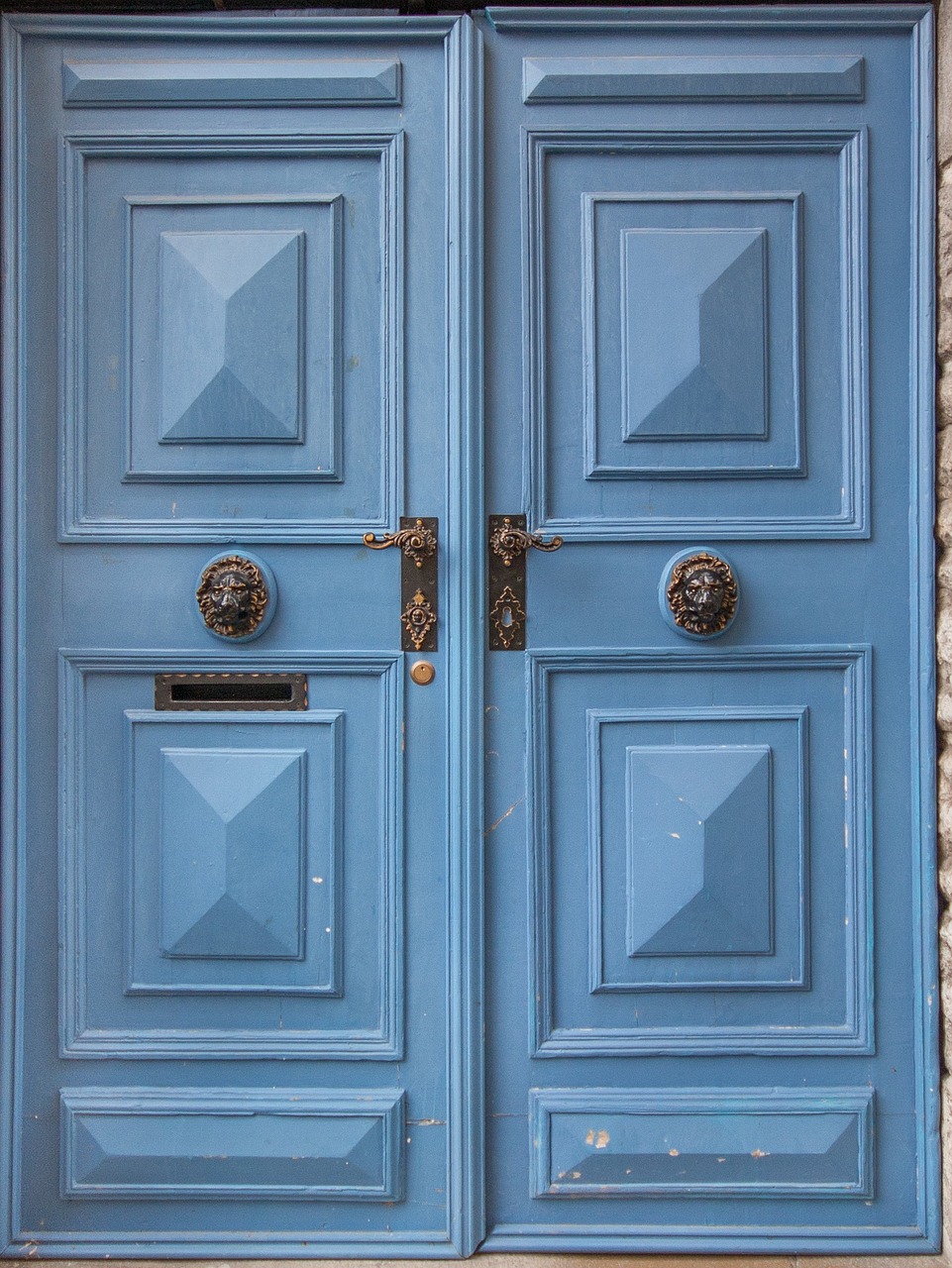
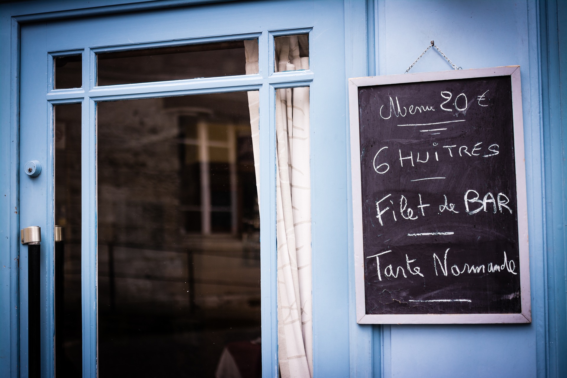
French Blue is seen in the vibrant, painted woodwork throughout the entire, ever-stylish country of France. Woad blue was the origin. This sumptuous blue is used everywhere - in the lintels, sashes, shutters, doors, and more.
2. Haint Blue
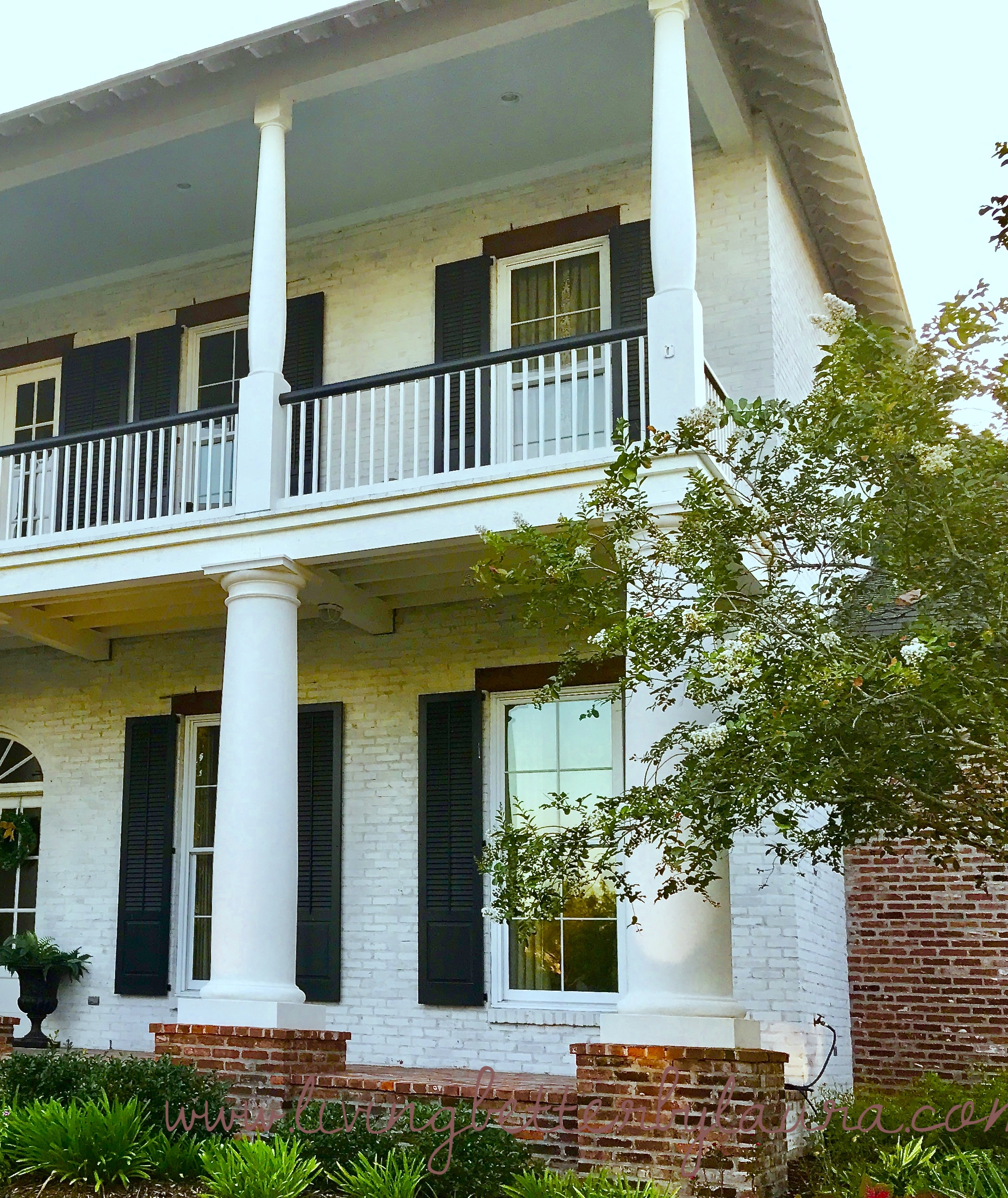
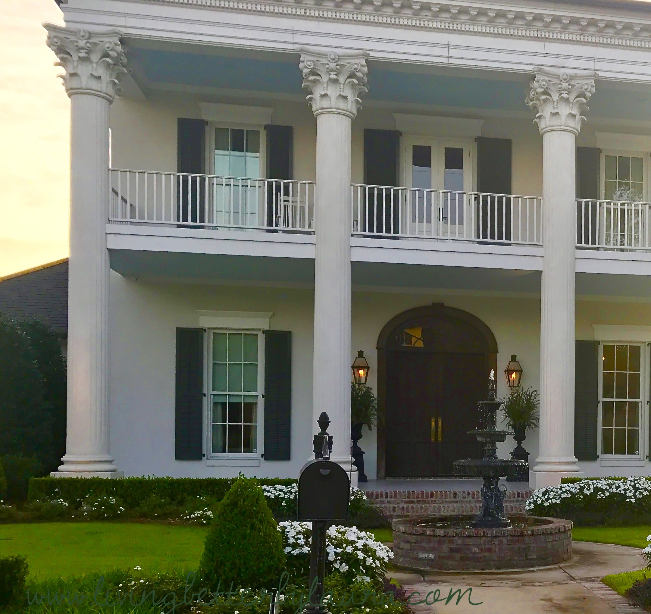
Scenes from my 'hood above...
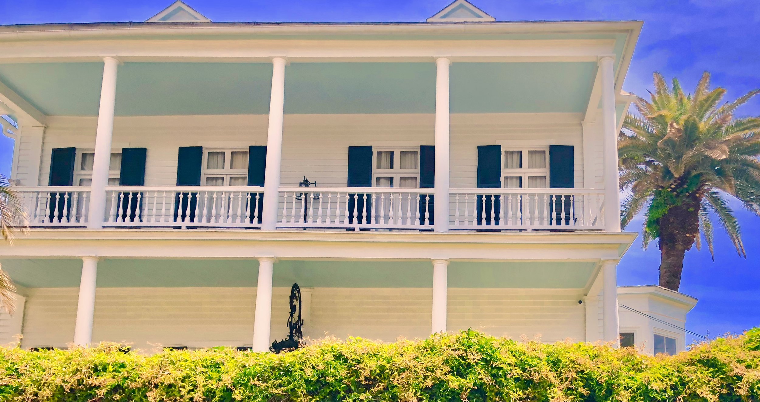
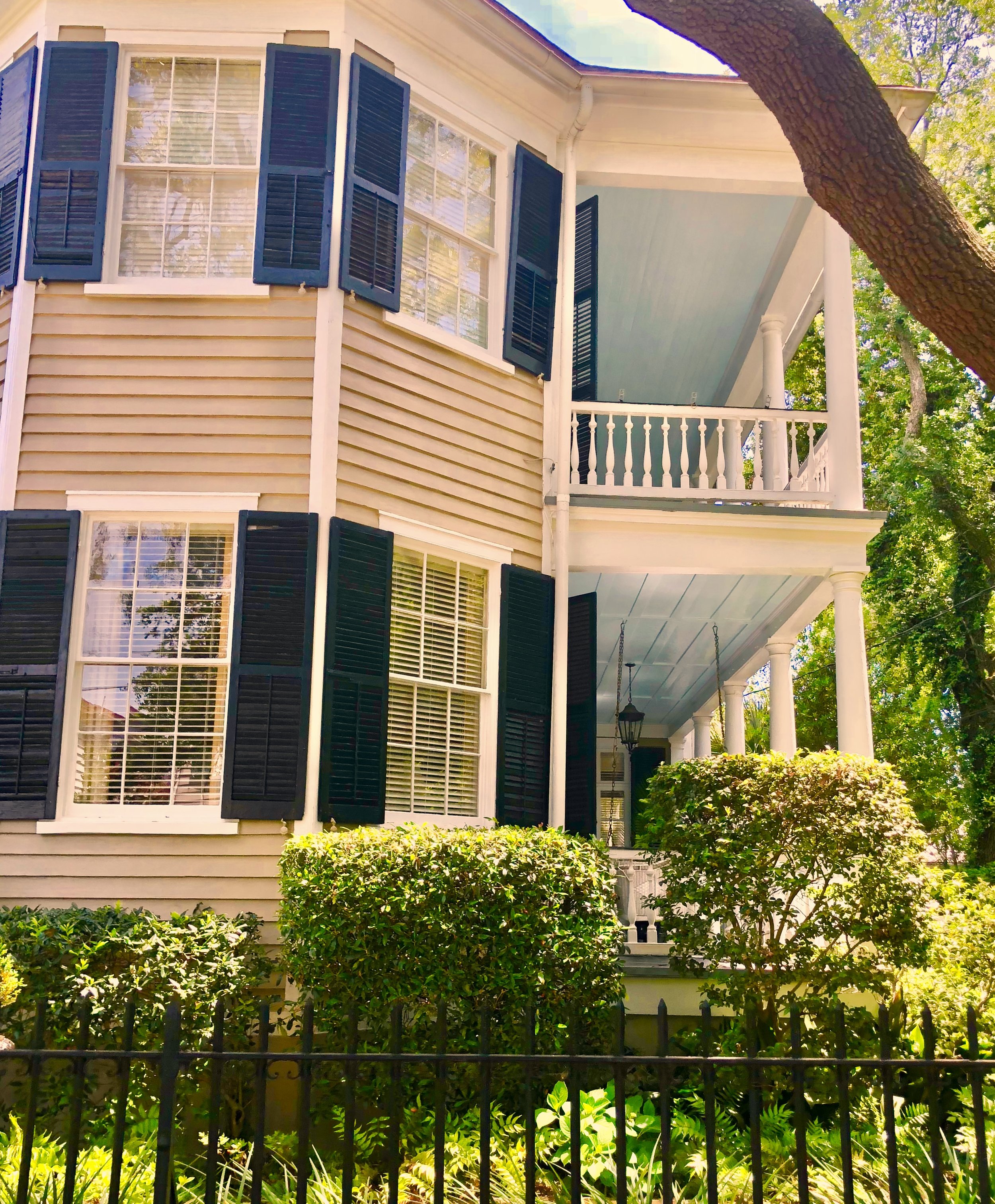
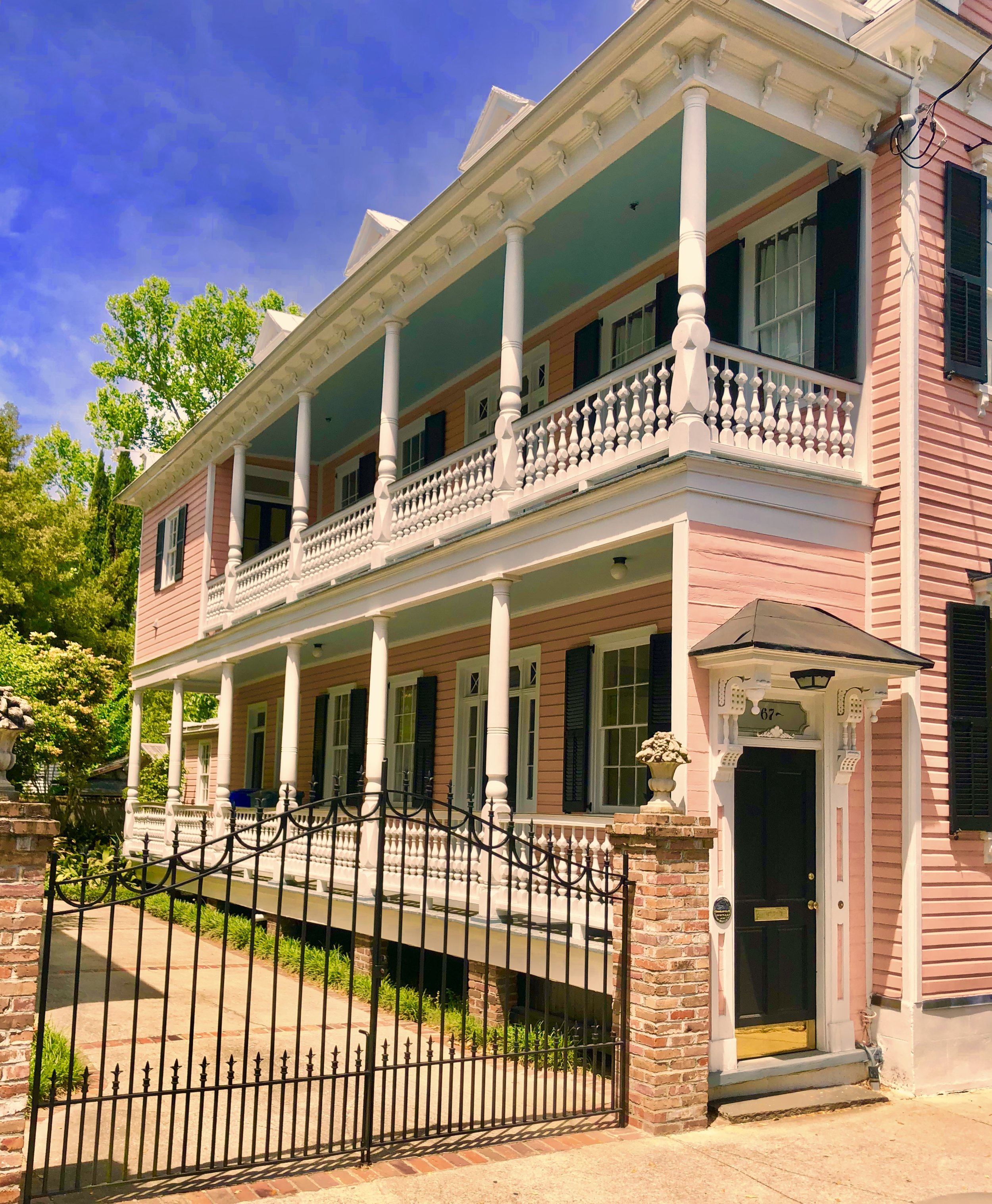
Scenes from my trip to Charleston, SC above...
A blue close to my home and heart is Haint Blue. Haint, or Hant, is a rural word for a spirit, ghost or anything that haunts the living. In the South, there's a rich culture brought to the area from Africa. Unfortunately, it came with the atrocities of slavery. The U.S., and in my case Louisiana, has a vivid cuisine, music, language, and spirituality brought over by those forced captives.
But I digress… back to the color, Haint Blue.
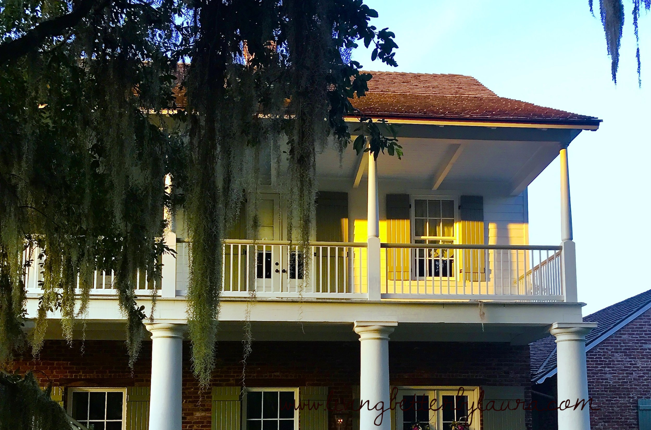
Next time you visit a pre-Civil War, southern U.S. city, glance up at the ceilings on the front verandas of the antebellum homes. You’ll notice a good number painted a light blue. It’s a very pretty touch, with a great visual appeal. But there's more to it than meet’s the eye…a lot more.
You can find these blue porch ceilings in old southern cities such as New Orleans, Charleston, and Savannah. These houses use the blue to preserve the historic details of old architecture. But, you can also see it in the area's newly built homes that lovingly carrying on the old traditions. This historic look now varies from sky blue to turquoise. Whether you like modern decor or a mix of contemporary and antiques - a blue exterior ceiling fits any scheme.
Maybe your desire is to preserve tradition…or, just maybe, you believe in haints.
Blue ceilings are seen in Victorian “painted ladies” in Boston, San Francisco or Philadelphia, all far away from the Old South. It's an excellent paint concept. It enhances natural sunlight, brightens any area, or adds a color pop to beautify your porch. But this is, definitely, not Haint Blue.
One theory, of Haint Blue, is the blue color fools wasps and mosquitos. Both pesky varmints are said to mistake blue ceilings for the sky. These bothersome biters prefer shade. A blue topped veranda, supposedly, encourages them to flee. No nest building, buzzing, and flitting near your front door. However, I wouldn't bet on it.
This theory assumes these creatures cannot tell a man-made ceiling from Mother Nature’s endless expanse of sky. But, still, this is not Haint Blue.
Haints are the spirits of the dead who must roam the earth. Talk about having the blues.
Haint Blue is a matte, chalky version of sky blue. Another tradition says it's supposed to resemble water. It's a rare body of natural water that would be the actual color of Haint Blue paint.
Another fable stipulates that haints can’t cross water. A blue gallery ceiling, above the front door, prohibits haints from entering the house. I’m not sure why the tradition didn’t extend to painting floorboards. Wouldn’t that appear more water-like to the gullible spirits? Those haints must be easily fooled by illusions.
In the early U.S., slaves farmed tobacco. After the American Revolution, the U.S could no longer import tobacco to the Europeans. They’d burned those bridges by declaring independence from England. The tobacco market faltered when trade became landlocked.
Slaves had been utilized in the south on rice, cotton and indigo plantations. But, after Eli Whitney invented the cotton gin in 1793 and eased the process, cotton farming boomed. The need for workers increased. Cotton grew well in the hot South. Cotton farming spread across South Carolina to Georgia and new lands west of the muddy Mississippi. The slave economy became centered and, forever associated, with the plantations of the deep south.
By 1850, over half of the slaves farmed the expanding fields of cotton. The slave traders took Africans from the dwindling plantations in the Caribbean and South America over to the new colonies of America. The slaves, from different tribes, mixed their cultures with traditions of the islands, South America, Native Americans and various Europeans nationalities. New rituals and traditions were formed from the brew of religions and folklore.
The history I know best is that of South Louisiana. Its culture is intertwined with the rich saga created by disenfranchised slaves. Voo-doo, gumbo, and Creole culture were born from a melting pot of Catholicism, France, the Caribbean, Spain, Cajun (French Canadian) and Vodoun, a West African religion. Most slaves were converted to Christianity and incorporated their African heritage into the new faith. Belief in the supernatural, superstitions and a deep spirituality still reigns in the Big Easy and Cajun Country.
The same can be said of two enduring colonies of slave descendants that still exists in South Carolina and Georgia. In South Carolina, the Gullah communities were primarily situated on the barrier islands. The Geechee settlements began on the Sea Islands of Georgia. After the Civil War, the Gullah and Geechee remained isolated due to the desolate nature of the barrier islands when slavery was abolished. As a result, both groups have retained the valuable folklore and old traditions that existed during slavery.
Ghosts, conjurers, and spirits were part of their beliefs. Charms, incantations and spells were used to protect those plagued by spirits of the dead not yet “crossed over”. One Gullah and Geechee story says the color blue scares away troublesome spirits. In their version, haints don’t like blue because it's a heavenly color, like the sky. They are afraid of anything heavenly. It's created a paint tradition that endures, borrowed from heady Creole culture.
Are the exterior ceilings of my house painted Haint Blue, you may ask? No, not yet. We moved into this home four years ago. To date, it hasn't needed repainting. But, you can bet, I'll be considering blue when painting time comes. I think it's a great look. Above are photos of homes in my neighborhood. They uphold tradition and add a beautiful touch to their outdoor decor and curb appeal. For more blue ceiling photos - go to my Instagram page!
3. Tiffany Blue
How many colors have their own proprietary, standardized Pantone hue? How many companies have made their brand color commercially unavailable and not published in the Pantone Matching System or swatch books?
The subtitle was a major give away. Yes! It’s Tiffany's and Tiffany Blue. An immediately recognizable aquamarine blue. And, it's now used legally and exclusively by Tiffany’s.
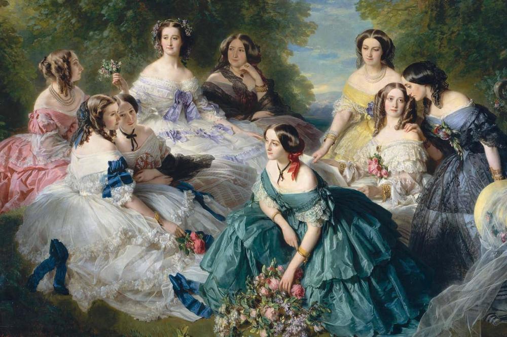
And, now we return to France. France was still the arbitrator of style in the 19th century. French fashion was still the epitome of the well-dressed woman. Empress Eugenie de Montijo was the wife of Napoleon III. She was the “it girl” of her time. It's said that Mr. Tiffany saw her portrait and knew, instantly, that the color she wore would be the rage everywhere. He decided this shade would be the official color of his store and business - way before color branding was a hot topic. He was a man before his time on the psychology of color.
“Charles Lewis Tiffany did not invent the color, now called Tiffany Blue. He was, however, astute enough to know a killer trend when he saw it.”
Another fable says Tiffany chose the color turquoise because it was a favorite of brides of that era. Started by Queen Victoria, it was a tradition for brides to gift their attendants with a brooch of turquoise. At the time, the only Tiffany & Co. store in existence was the flagship on, where else…Fifth Avenue. Both names are pure NYC glam. The polished granite mansion, on the corner of 5th and E. 57th, with its beautiful window displays are a work of Manhattan art.
Charles Tiffany used the iconic color to adorn the cover of his Blue Book. Its said to be one of the first mail-order catalogs. This was no Sears catalog. Published, first, in 1845 it was filled with the store’s brilliant jewelry. Now, that’s my kind of “wish book”!
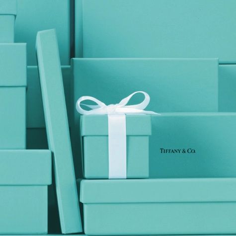
Mr. Tiffany, later, added shopping bags and other materials drenched in the iconic blue. Tiffany Blue and the blue box became a symbol of luxury as early as 1906 - only a decade after it’s inception. It's instantly recognizable as THE retail color - almost like the Golden Arches but much more luxe.
It quickly became a rule. A blue box was never allowed out of the store unless containing an item sold by Tiffany’s. Charles, himself, created the policy. The box was a hit, right out of the starting gate. Fanning the flames of exclusivity, C.T. created a coveted status symbol. Tiffany was a man ahead of his time with an astute marketing sense for luxury goods. He was into "branding" before it was a thing.
“Tiffany has one thing in stock that you cannot buy of him for as much money as you may offer, he will only give it to you. And that is one of his boxes”
The custom color that Pantone formulated for Tiffany is officially Number 1837 in their System. Tiffany's heads of state approached Pantone to formulate an exact replica of Charles Tiffany’s color. They wanted the hue standardized to ensure it was always correctly reproduced. 1837 honors the year Tiffany’s was founded. In 1998 Tiffany’s received their trademark from the U.S. government. The blue box with its white ribbon and the term “Tiffany blue box” are trademarked. You can be found guilty of trademark infringement for selling empty blue Tiffany boxes on eBay or Craigslist.
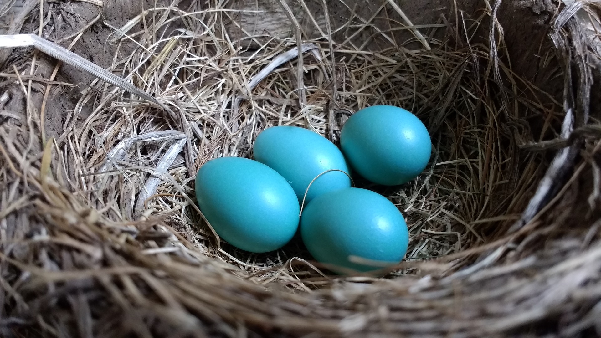
Tiffany Blue is described as robin’s egg blue. Who doesn't salivate when presented with the one-of-a-kind blue cube adorned with a white satin bow. You'd recognize it anywhere - a gift from Tiffany’s. It represents love, magic, and riches like no other box.
Icons Associated with an Icon
Tiffany’s is not just a jewelry store. Like it’s blue, it's an icon featured in movies and literature. Wealthy people have parties there. Decorations aren’t needed with all that bling on view. What you save in your decorating budget - you blow on security guards.
Probably the most famous use of the store is found in the theme and title of “Breakfast at Tiffany’s”. First, it was a novella, by Truman Capote, and then a movie, starring Audrey Hepburn - both were instant hits.
“Holly was a symbol of all these girls who come to New York and spin in the sun for a moment like May flies and then disappear. I wanted to rescue one girl from that anonymity and preserve her for posterity.”
In the scene that represents the theme and title, Audrey’s character, Holly Golightly, wears an exquisite Givenchy LBD, gloves, gigantic ropes of pearls, oversized sunglasses with a tiara in her perfectly coiffed updo. She is gazing through the window at Tiffany’s having breakfast - a Danish and coffee.
Tiffany’s has its own role in the movie. Holly suffers from the “mean reds”, her description for anxiety and fear. Her cure is to visit nirvana - Tiffany’s. Makes perfect sense!
“No. The blues are because you’re getting fat and maybe it’s been raining too long; you’re just sad, that’s all. The mean reds are horrible. Suddenly you’re afraid and you don’t know what you’re afraid of. Do you ever get that feeling? …Well, when I get it the only thing that does any good is to jump in a cab and go to Tiffany’s. Calms me down right away. The quietness and the proud look of it. Nothing very bad could happen to you there, not with those kind men in their nice suits, and the lovely silver and alligator wallets,”
Cue the movie’s song, Moon River, by Henry Mancini and someone, please, get a cat. See the movie or read the novella if you haven’t, cat reference included.
Color Codes for Tiffany Blue
If you're interested in the color codes closest to Tiffany Blue, you can try:
Hex triplet: #81D8D0
HSV (h, s, v): (174°, 40%, 85%)
SRGBB (r, g, b): (129, 216, 208)
4. Blue and White Porcelain
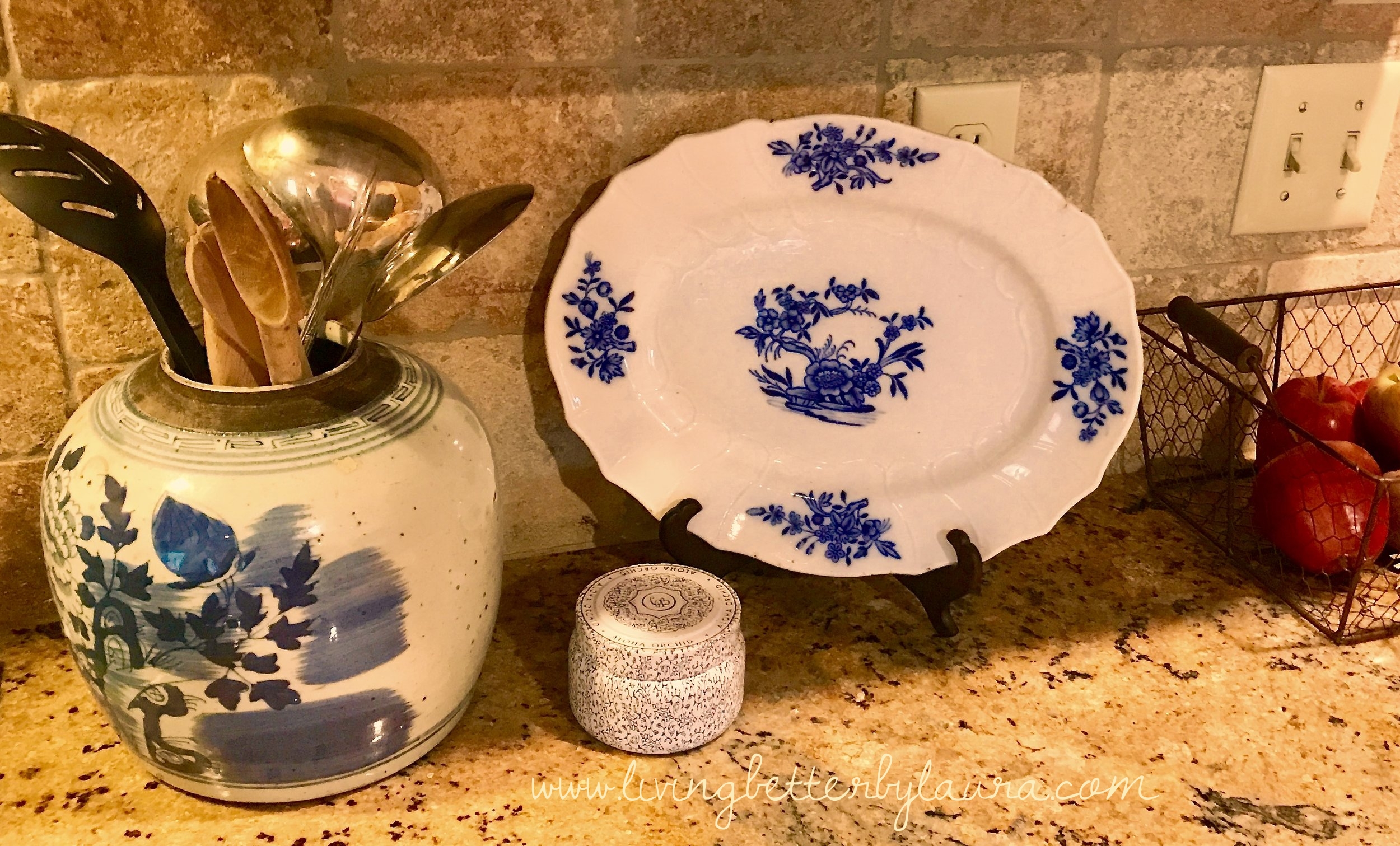
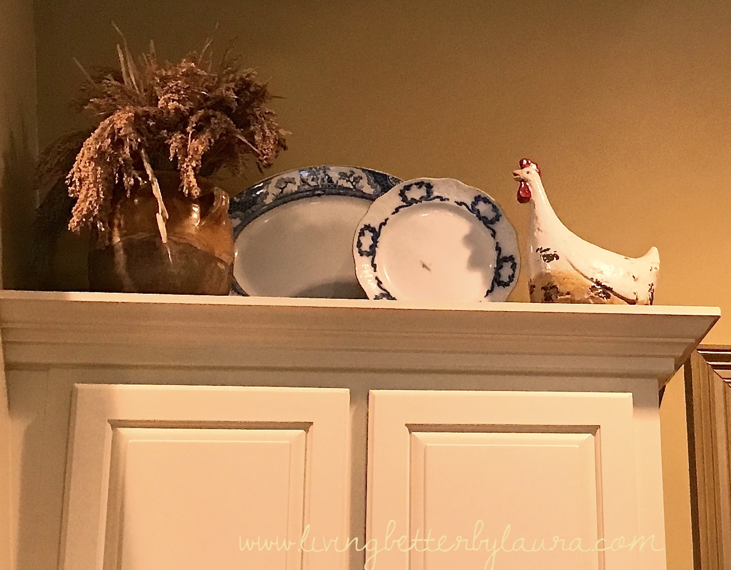
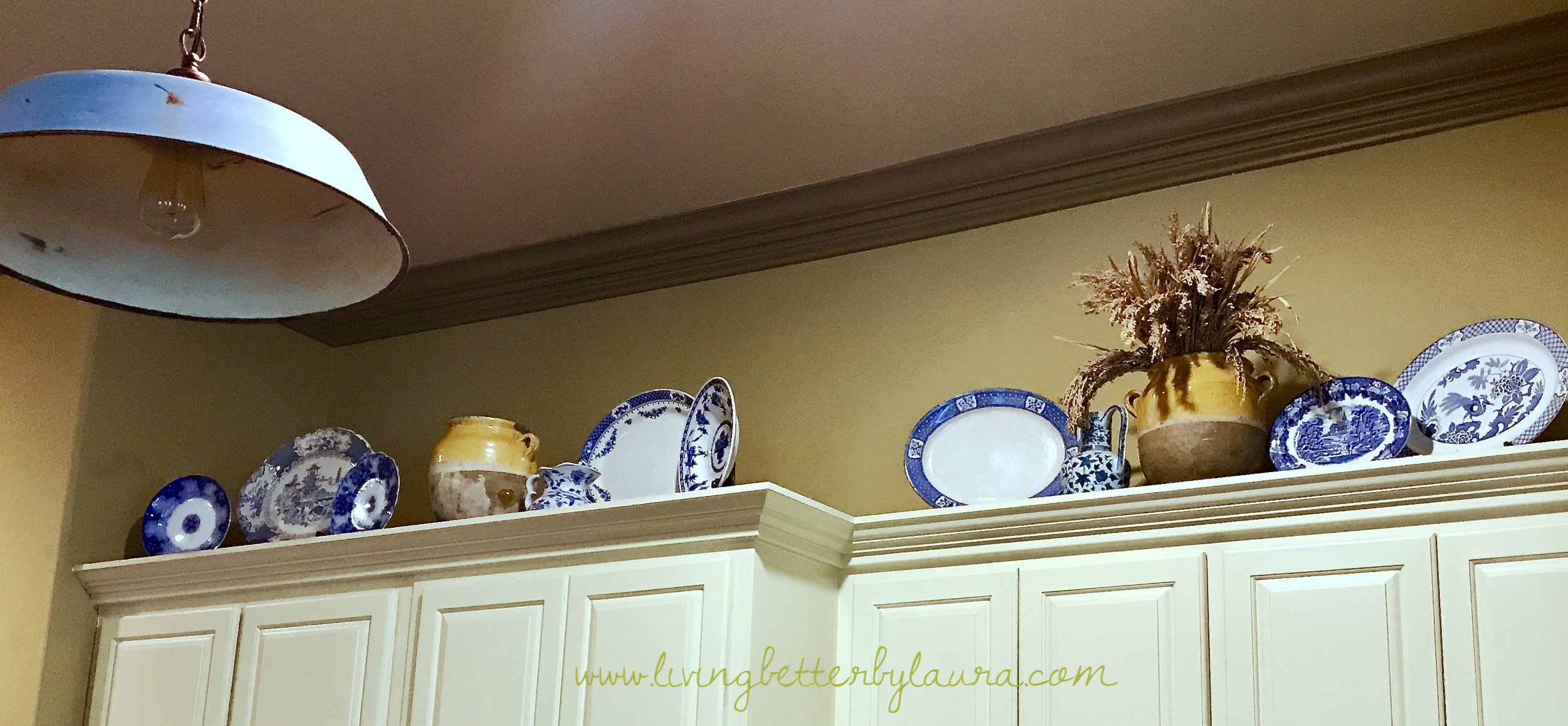
A favorite accent, I've used throughout my home, is blue and white porcelain. The origin of blue and white pottery is thought to be Iraq before the 9th century. And it's popularity as never dimmed.
In the beginning of this post, I mentioned the initial blue that was used for pigment was developed from valuable Lapis lazuli, a jewel, found only in the mountains of Afghanistan. Later, other, blue pigments were created in ancient Mesopotamia from, equally valuable, cobalt found in parts of Oman, Iran, and Saudi Arabia.
Early blue and white pottery pieces were of a heavy earthenware style. Later, the Chinese created, what we call today, fine "china". The finest porcelain has a translucent appearance instead of a thick, opaque, look. Using the Persian's color and the Chinese' technique this iconic style began at the start of the 14th century.
From China, blue and white pottery found its way to Japan. Then, in the 17th century, blue and white pieces were imported from the Orient to Europe. And, the rest, they say, is history.
Its popularity continued to grow in leaps and bounds. Wars and unrest affected Chinese output at times but it did not diminish the Europeans desire for the art. So, Europeans sought to copy the Chinese techniques and create a homegrown version of blue and white.
The Italians and Germans managed to break the code using, both, spies and experiments - a sort of porcelain espionage which we are grateful for. The Italian Medici and German Meissen studios were first to show a blue and white European design. They were followed by the French and, then later, the English and the Dutch. Early styles were known as Blue Onion, Chinoiserie, Delftware and Willow.
The irony is, now, European and American blue and white pottery is being manufactured in China. What goes around comes around!
Blue and white, remains one of the most, time-defying, color combinations used in decor, design, and branding. For home decor - walls, paint, furniture, rugs, shutters, drapery - the color, blue, stands the test of time. A long, long time. Centuries!
And, as an accent color, blue and white porcelain has retained its popularity. It can be combined with a modern look, a traditional vibe, farmhouse, shabby chic or minimalistic. Its a versatile addition to any room, it draws the eye to a pleasing icon of history.
5. Annie Sloan Chalk Paint, Shades of Blue
In this case, the icon is the product - Chalk Paint by Annie Sloan, and what can be accomplished with its shades of blue. Louis Blue, Provence and Duck Egg Blue are my favorites.
Louis Blue is a perfect pastel version of French Blue. Provence is green-blue. Duck Egg Blue is a turquoise that Annie calls a “Rococo blue”. All are similar to tints seen in the iconic painted, antique Swedish or French furniture style.
Annie Sloan developed her paint and started a revolution.
Annie developed her product in 1990. She had an idea for a paint and couldn’t find anything similar on the market to meet her needs… so she made one! Chalk Paint was born.
I know I speak for bazillions of DIYers, we are SO glad she did! Annie trademarked the name Chalk Paint. Now, Chalk Paint is synonymous, like Kleenex for a tissue. Any milky, matte, “chalky” paint is now known as chalk paint.
After Annie’s success, the market was flooded with copies. Every craft company, including Martha Stewart, put out a line of matte paints we refer to as “chalk paint”. When we use any version, we call it - “chalk painting”. Annie's paints are still the gold standard but there are some other great matte paints on the market now keeping up with the demand.
Annie formulated her paint with great care and research. She gives her paints lovely names. Each title speaks to a beautiful place, object d’art, or romantic name. A few examples: Emperor’s Silks, French Linen, Versailles, Antibes Green, Antoinette and English Yellow. She followed her paint innovation by adding brushes, waxes and wall paint to her line.
The usability of the paint is a dream. You can apply it to any surface and it will adhere - smooth, and gorgeous. Almost any finish is possible - textured, distressed, crackled, a wash or smooth -in simple-to-do techniques. Chalk paint dries really, really fast - to a yummy matte finish. And, wait for it..no prep needed!
Let me say that again. No prep needed. No sanding or varnish removal required. Start with a clean surface and - just paint. The prep part is what prevented me from painting or refurbishing things in my home for years. Then I joined the cult following of everything Annie Sloan.
When I said Annie started a revolution I wasn't exaggerating. Chalk painting has taken the DIY world by storm! I, for one, will chalk paint anything that stands still long enough. It's a breeze to use, even for a rank amateur. The list of uses for chalk paint is endless. I've painted upholstery, baskets, metal, work, plastic, glass - with great results each time.
In addition, Annie has authored 20 books. I’ve listed my 3 favorites below. I've used these, countless times, for ideas and inspiration. You'll see all of Annie's blue hues on the free download at the end of the post. Its a resource listing all the best blue colors for interior design. Watch for upcoming posts featuring some of my fun, easy DIY projects.
I've used my Annie Sloan books for suggestions, tips and examples for dozens of DIY projects
My Three Favorite Annie Sloan Books
Quick and Easy Paint Transformations: 50 Step-by-Step Projects for Walls, Floors & Furniture
Creating the French Look: Inspirational Ideas and 25 Step-by-Step Projects
Color Recipes for Painted Furniture and More: 40 Step-by-Step Projects to Transform Your Home
But, back to blue. Annie Sloan’s line has several shades of blue, each beautiful in its own right. There’s Aubusson Blue, Napoleonic Blue, Greek Blue, Old Violet, Giverny, and Provence. They range from light to rich, but each is a vibrant blue. My favorites, Louis and Duck Egg are muted shades. They act as neutrals in my book, at ease in almost any decor - cool or warm.
Annie’s white and off-white tones continue to be her best sellers. But her blues always rank high on retailer’s (she calls her retailers Stockists) top 10 Chalk Paint lists. The blues that continue to rank high are Aubusson Blue, Provence, Napoleonic Blue and Duck Egg. I’m not sure where my other perennial favorite, Louis Blue, ranks.
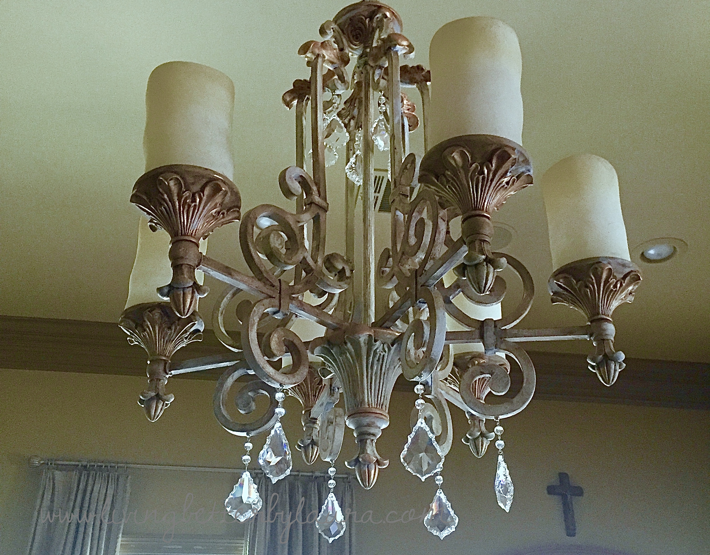
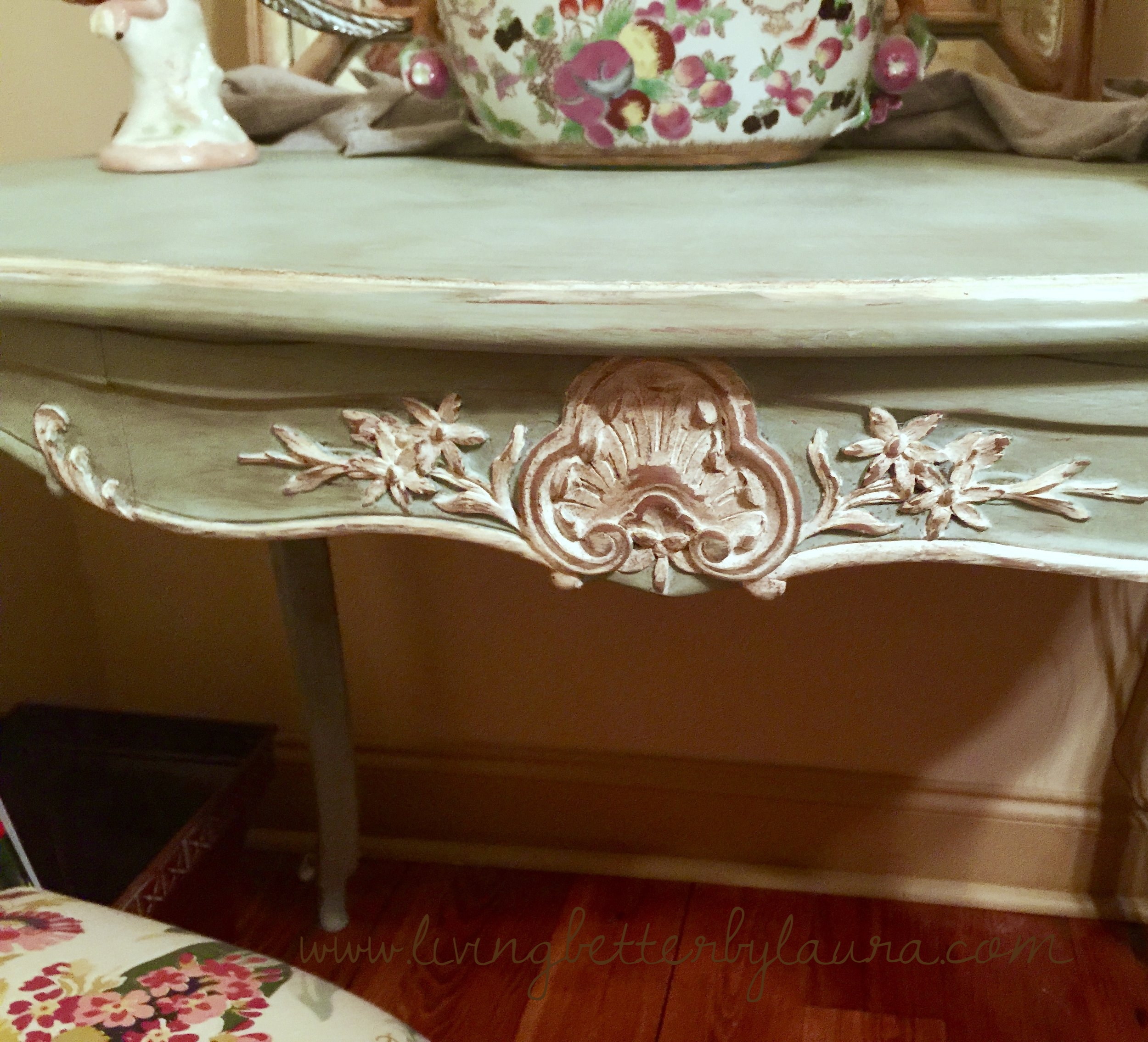
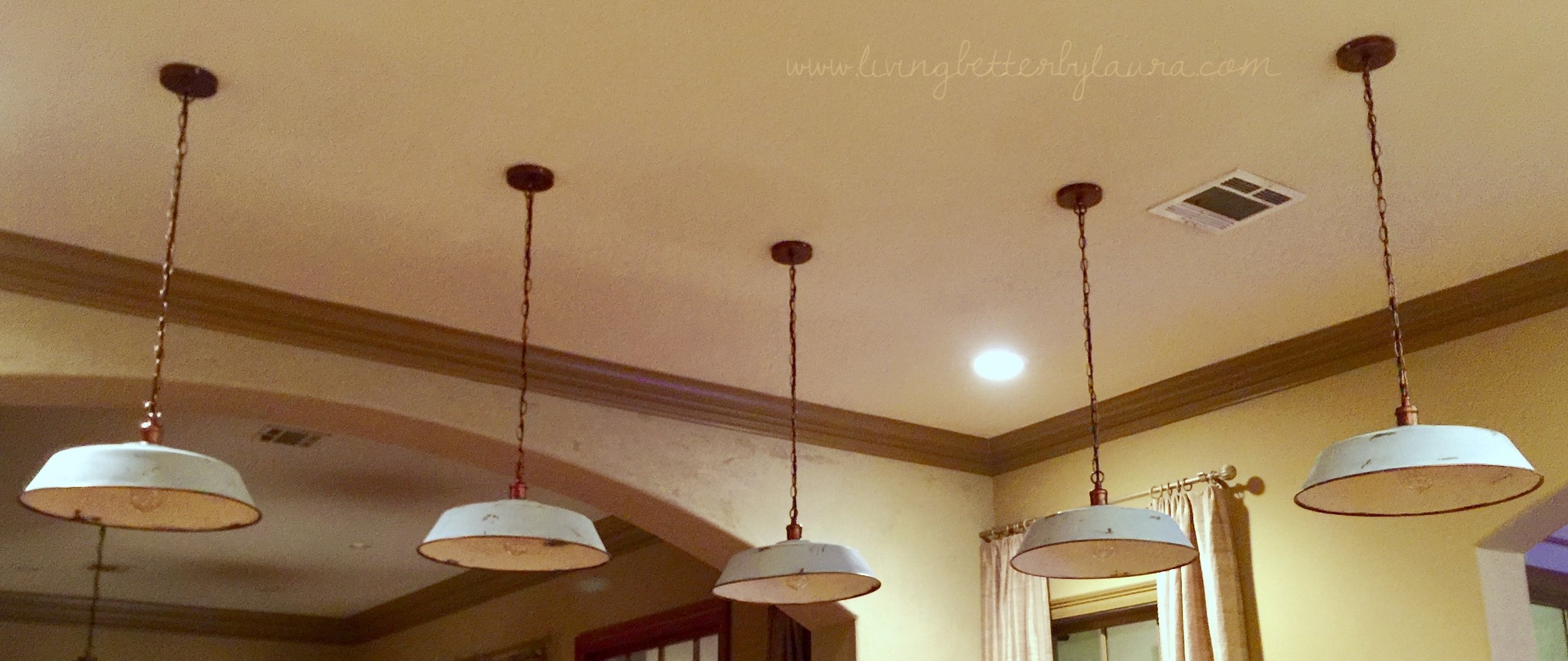
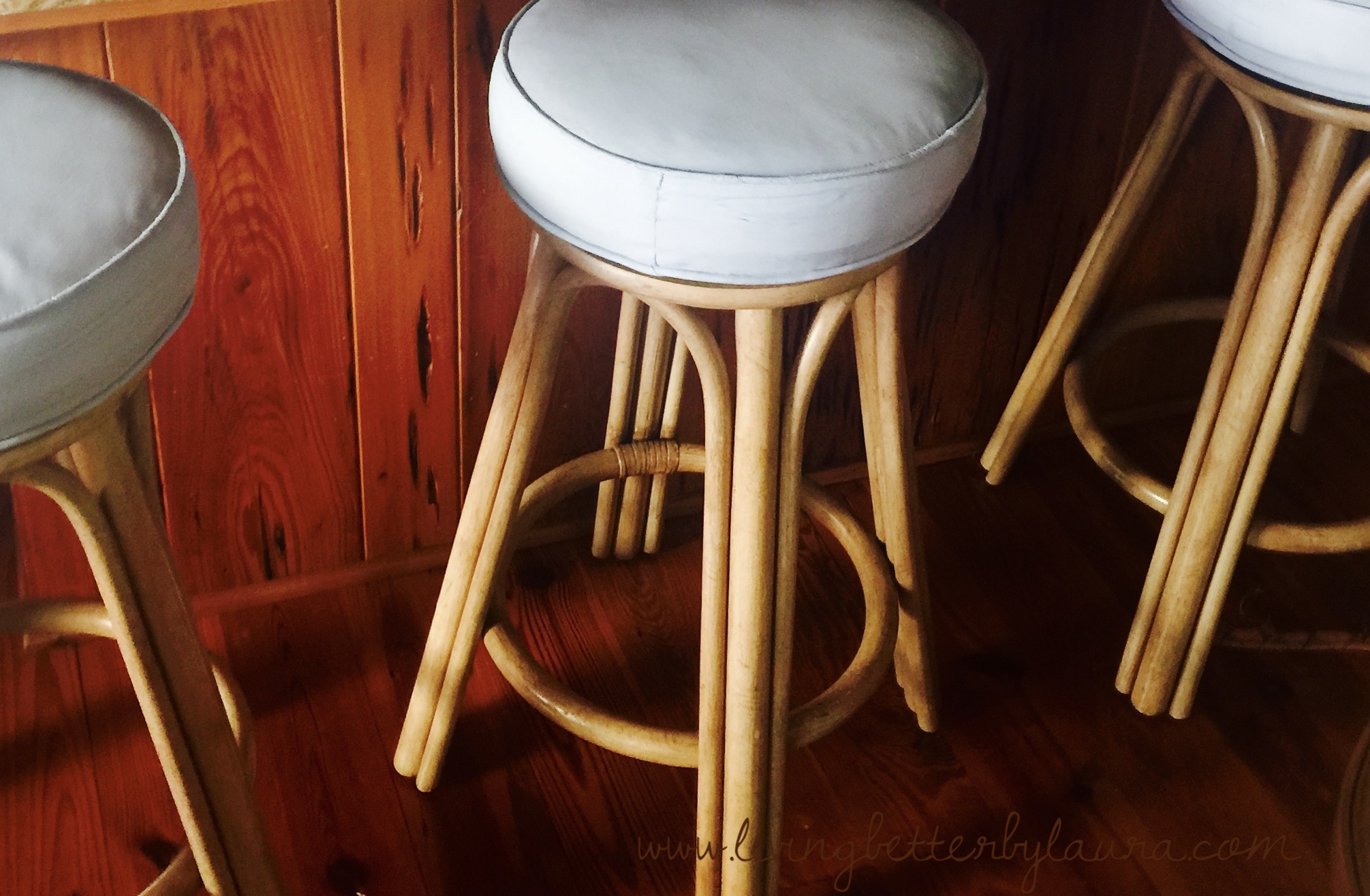
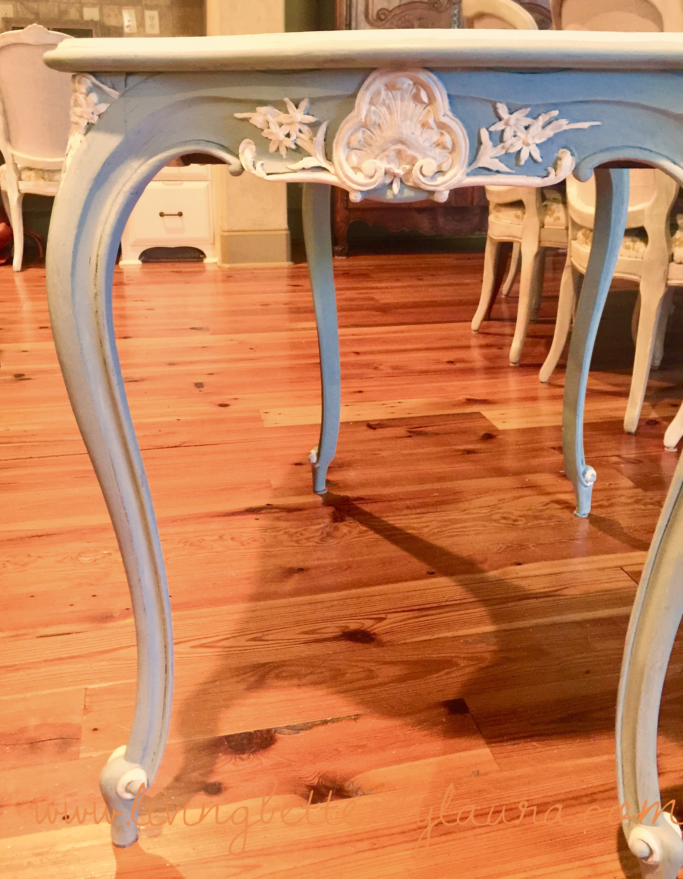
I used Louis Blue in so many of my DIY home decor projects as seen below. I'll go over them step-by-step in future DIY posts, so stay tuned if you're crafty like me!
Final Thoughts on Living Better at Home
Here's the list I promised. Subscribe below to receive the free e-book A Selection of the Best Shades of Blue Paint for Decor. You will receive a link to download this free tool of all the best blues.
What are your thoughts? Have you used blue in your home? Share your ideas and favorite colors of blue in the Comment Section below. Also, we'd love to see photos of your blue DIY projects or photos of where you've added blue to your home.
If you think these ideas might be useful to other color enthusiasts, DIYs or decorators, please share through social media.
Do you love home decor, DIY or interior design? Check out this article on The Best Way to Make a New Mirror Look Old about distressing and antiquing DIY style
Related Posts
Subscribe below to receive the free e-book on the best shades of blue...not just for interiors but for all home decor needs
To be the first to receive the latest, amazing health and lifestyle ideas, sign up for our newsletter below and you'll be LIVING BETTER by laura.
